Keys to a Successful Poster
© Martha J. Bianco, Ph.D.
Design Elements
Size Issues
- Poster board should be either at least a
standard 27" by 29" regular foam or trifold foam board.
- The poster must be legible from a distance
of four feet away.
- Use 32-point for capital and lowercase
mixed and 24-point for words in ALL CAPS.
Font
|
|
|
|
Sans serif font (such as Arial) works best for titles and large print. |
Serif font (such as Times New Roman) works best for close-up reading and for web site references. |


Color Issues
|
|
|
·
Font color. On white paper, fonts should in general be black. Use colored font sparingly and only to
make a specific point or to help navigate the reader through the poster.
·
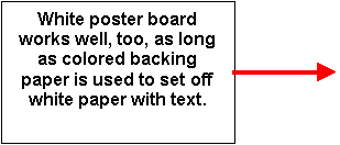
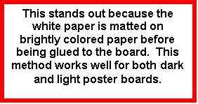
Text paper. Paper on which the text is typed should in general be
white. It is, however, very
effective to provide a colored border around the text box (see above). A wide 1-inch colored border can be
very effective, particularly if you have selected to use a white poster board.
So, in general you have a white or dark poster board, white text boxes – possibly with colored borders – and simple black text. Now, how to add other color to your poster to make it stand out?
·
Photographs
o Color
glossies work best
o Use
a slow shutter speed to capture movement (e.g., speeding traffic)
·
Arrows and borders to help guide the reader
through the poster (e.g., a dashed yellow line on a black poster board makes
for an effective line to link themes related to traffic issues)
This is the trickiest part of the poster. It
is very challenging to create a poster through which a reader will be able to
navigate with ease. And it must be easy! A difficult-to-read poster will only
frustrate a reader. Here are some hints:
- Have a clearly identified, logical “beginning
place” such as in the upper left-hand corner. Identify this
beginning place with a clear title in large font, something like
“Introduction.”
- It will not be intuitively clear to most
readers where to go next:
should they move to the panel to the right of or to the panel below
the Introduction? Here is where it is helpful to use arrows and/or lines or
make the transition obvious by arranging text boxes and photos in a
downward staircase fashion. Most American audiences will always read in a
left-to-right, top-to-bottom fashion. If you provide this, their job is easy. If you defy this, their job is
difficult!
- Alternate between photos and text. Too much text can be frustrating,
boring, and challenging – no matter how crucial you think it is
- Keep your text short and to the
point. Eliminate unnecessary
words; short bulleted phrases are easier to read than grammatically
correct, long sentences.
- Each bulleted phrase should be a
one-liner. This is
challenging, but usually possible!
- Proofread. No typos, punctuation errors, misspellings, etc.,
allowed!
- Do not forget your name!
- All photos and other illustrations should
include a caption and the source.
- Keep things simple and sparse.
- Your final panel should include sources and references. The font here can be small; you just want to make sure your work is documented.